Where images speak louder than words
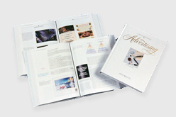
Advertising is everywhere. In print, on the internet and in our heads. Mr. Whidden has been creating ads for employers and companies for years. And, in fact, he has even helped "write the book" on advertising. As the Collaborative Editor for "Contemporary Advertising," the leading college textbook on advertising (click to show the book image to the left of this block of text), he wrote the creative chapters, worked with agents on getting approval for using ads featuring actors, celebrities and more. He's won awards for his advertising as well.
Of course, advertising isn't all Mr. Whidden does when it comes to promotions. He's an experienced public relations practitioner. He writes publicity articles (one of his promotional stories was featured on the first page of Section B of the New York Times). He's assisted a Vice President with an impromptu press conference, escorted well known newsmen on miitary facilities and set up three day trips for VIPs to visit radio and television talk shows and to speak before audiences of city and federal government officials.
Advertising is best used to promote awareness for a product or service. To do this, attention-getting images and headlines are needed. This is demonstrated by the light-hearted imagery and pun-oriented text in the ads and coupon book on the left half of the image above. In contrast, public relations advertising and promotional programs are best used to establish credibility via anecdotal information presented in different ways over time. A subtle difference can be seen between the ads on the left and the ads on the right half that feature a more moderate and factual approach with a focus upon broader concepts.
- The businessman with all the hats typifies why he can't get his marketing programs in order because he's too busy managing every other detail. That's why he asks "Must I wear all these hats to run (ruin) my business"
- The three vertical ads use a play on words and photos to say the university's student health insurance plan is suitable for everyone
- The CCN ads are simple and elegant. The images on the left go with the phrase "The Power of Being Connected" so well that you can feel "the power"
- The "Titanic Headache" ad's attention-getting iceberg can be seen larger on the "Illustrative" gallery page.
- The first image on the left of this text block shows that nicely designed ads can be printed on cheap paper ("pulp")
- The white book version of "Contemporary advertising" with one book showing the cover and others opened up to show sample pages and graphics inside.


