Although web sites have now become the brochures of today, there remain many corporations that prepare full color brochures for investors, car showrooms, charity fund-raisers, high-profile real estate projects, and more.
One of Mr. Whidden's interests is the use of colored inks printed over silver ink. The Cardiology posters (top image, upper left), Dominator Radiology proposal folders (lower left corner), the gold coins brochure (center), and the Emark brochure (very top, center) use these silver variations.
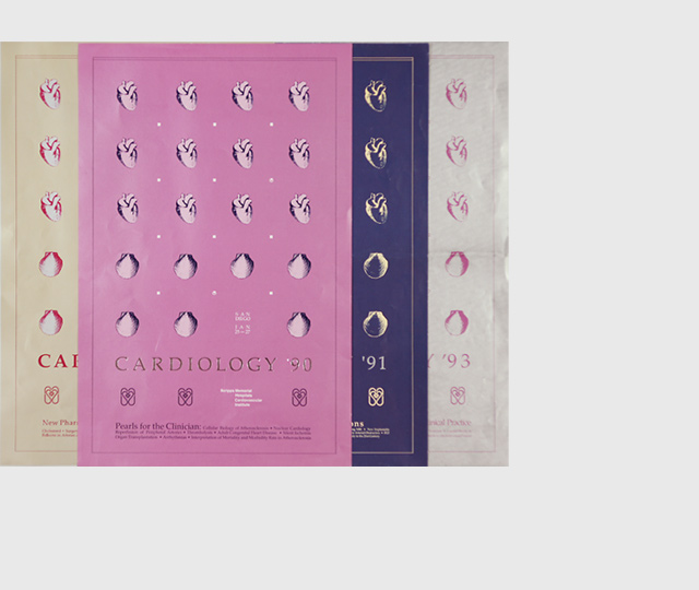
- an award-winning "Cardiology " poster series (upper left of top image just to left of this text block) for the Cardiovascular Institute at Scripps Memorial Hospital used the same design elements (four shown at left) with a slight modification to fit the each seminar's topic for eight years until the economy reduced participation. Of the handful of competing cardiovascular annual seminars, the Cardiovascular Institute's poster recognition factor helped make the institute the "last man standing" with enough registrations annually to keep it offering it another year or two
- The MCTSSA brochure cover (far leftand just to left of this text block) was designed for a Marine Corps unit responsible for setting up communication systems during beach landings to 30-day encampments. The people at the desk represent the communications function and, yes, a desk was actually in the water and the individuals you see reported their feet were freezing. Mr. Whidden created the concept, designed and produced the layout, and photographed this 4-page brochure and matching 9 x12-inch folder and the Marines brought up the heavy guns
- The brochure (in the center of the top image and just to left of this text block) with the stock certificates montaged with gold coins was for H.S. Perlin, Co., a rare coins/investment bullion gold dealer, who encourages investors to add gold to their portfolios (Mr. Whidden's concept, photography, brochure design and writing)
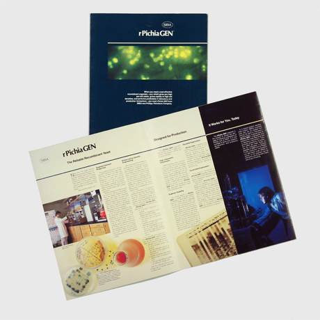
- a brochure design for "rPichiaGEN" (center, bottom and just to left of this text block) featuring the product name that Mr. Whidden originated for SIBIA, a division of the Salk Institute. The blue panel on the right opens up to reveal a series of charts showing the recombinant Pichia yeast's output performance when fed various chemicals. A newsletter using a matching color scheme and design elements (not shown here) was published quarterly for several years citing successes of those who leased the technology
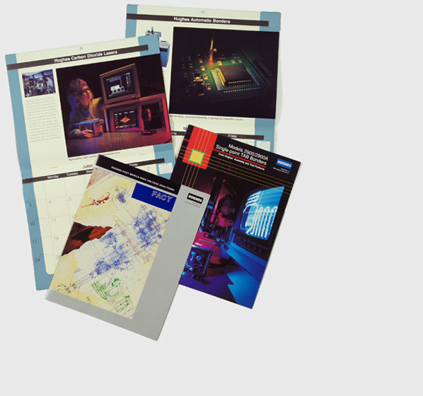
- Another military set of projects is the Hughes Aircraft company's Industrial Products Divsion Calendar (center-right, upper portion and just to left of this text block) and related brochures. the calendar is designed to open vertically, as seen here, to 11x17 inches. His photos of the woman engineer with a laser and a close-up of a laser bonding tool represents two of the eight product lines featured in the calendar. The brochures present the TAB bonder line of computer chip welders and the FACT product line of wire testing machines that assure all wires go to the proper devices from the switches in the control room of a radar station, cockpit of a fighter jet or commercial airliner, and more. The FACT brochure features an illustration by Mr. Whidden portaying the wire testors with an operator, a blue print of a portion of a wire testor, and various aircraft and radar images.
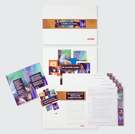
- The vertically opened brochure with gold foil and small booklet (right portion of the image and just to left of this text block) was designed by Mr. Whidden for CCN, once the second largest PPO in Calfornia (2002). The total package was a 17" x 8.5" four-color plus gold foil that opened up to reveal a full color booklet and a pocket with, in this case, one each of five data sheets for each of the major categories of employee health insurance that a businesses could buy.


